Challenge: Evolving the current visual identity into the digital space
Muze entered the scene after Cielo rebranding was finalized. Ours was a different mission: to expand the new visual language to the web. To get started with the project, our team explored the key questions:
- Can we improve and simplify the story?
- How can we create a more comprehensive digital presence?
- Which pages and UX flows within the website would be in use the most?
- How can we improve the overall user experience of the website?
User flows Planning
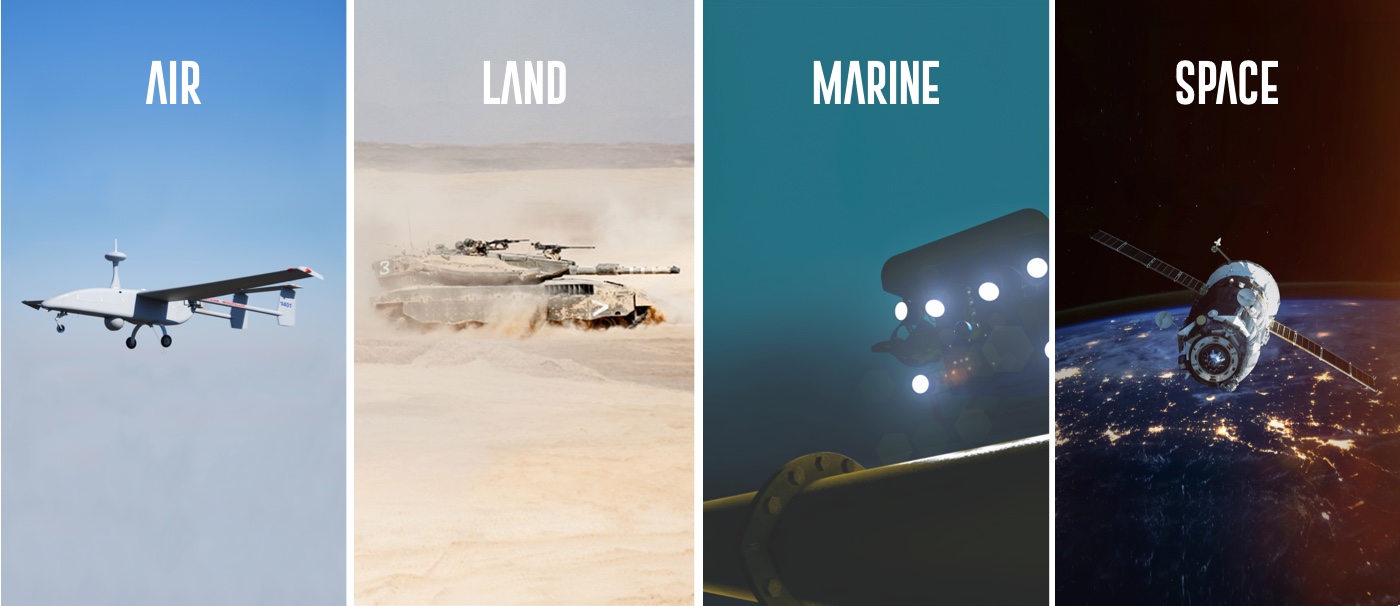
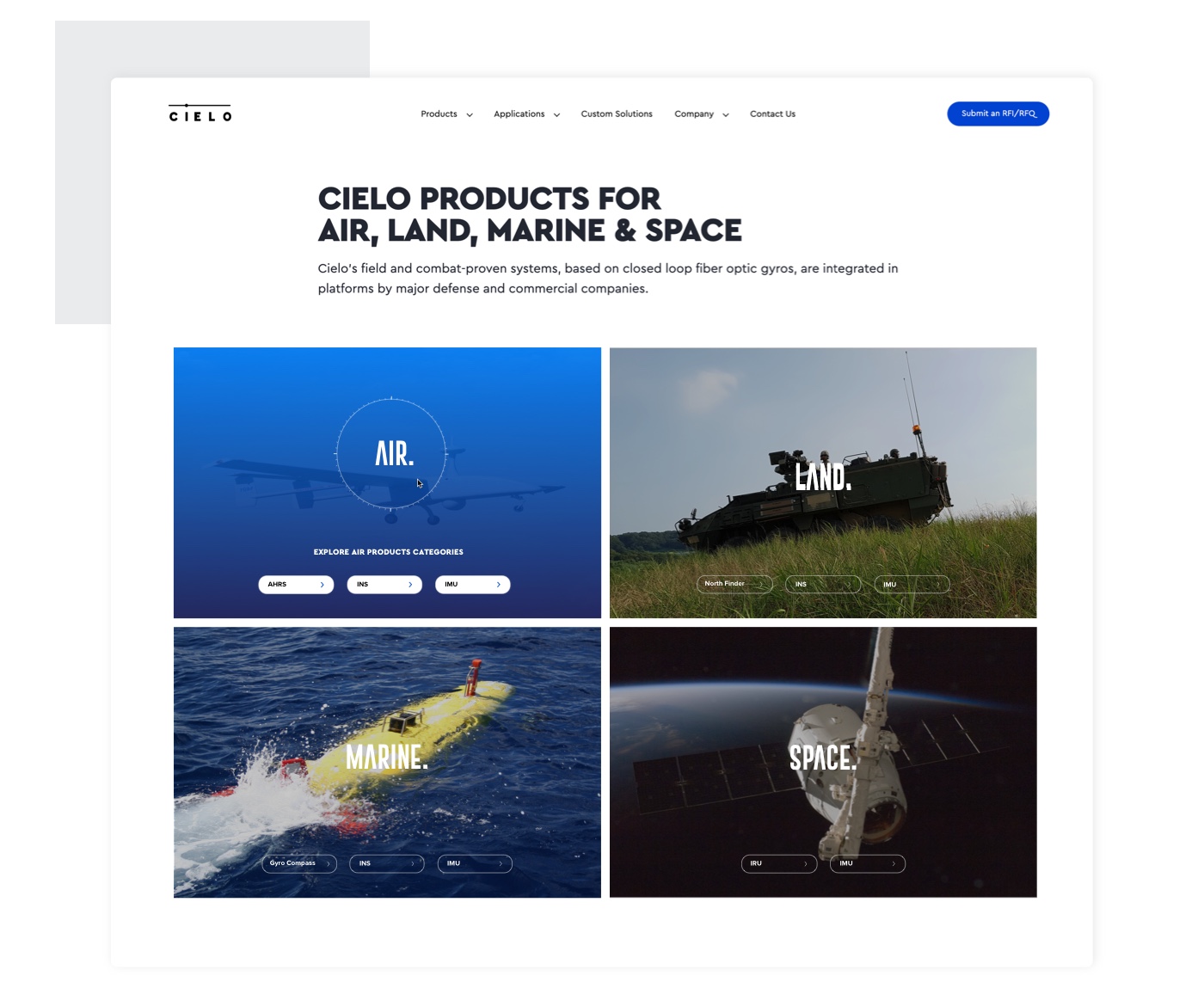
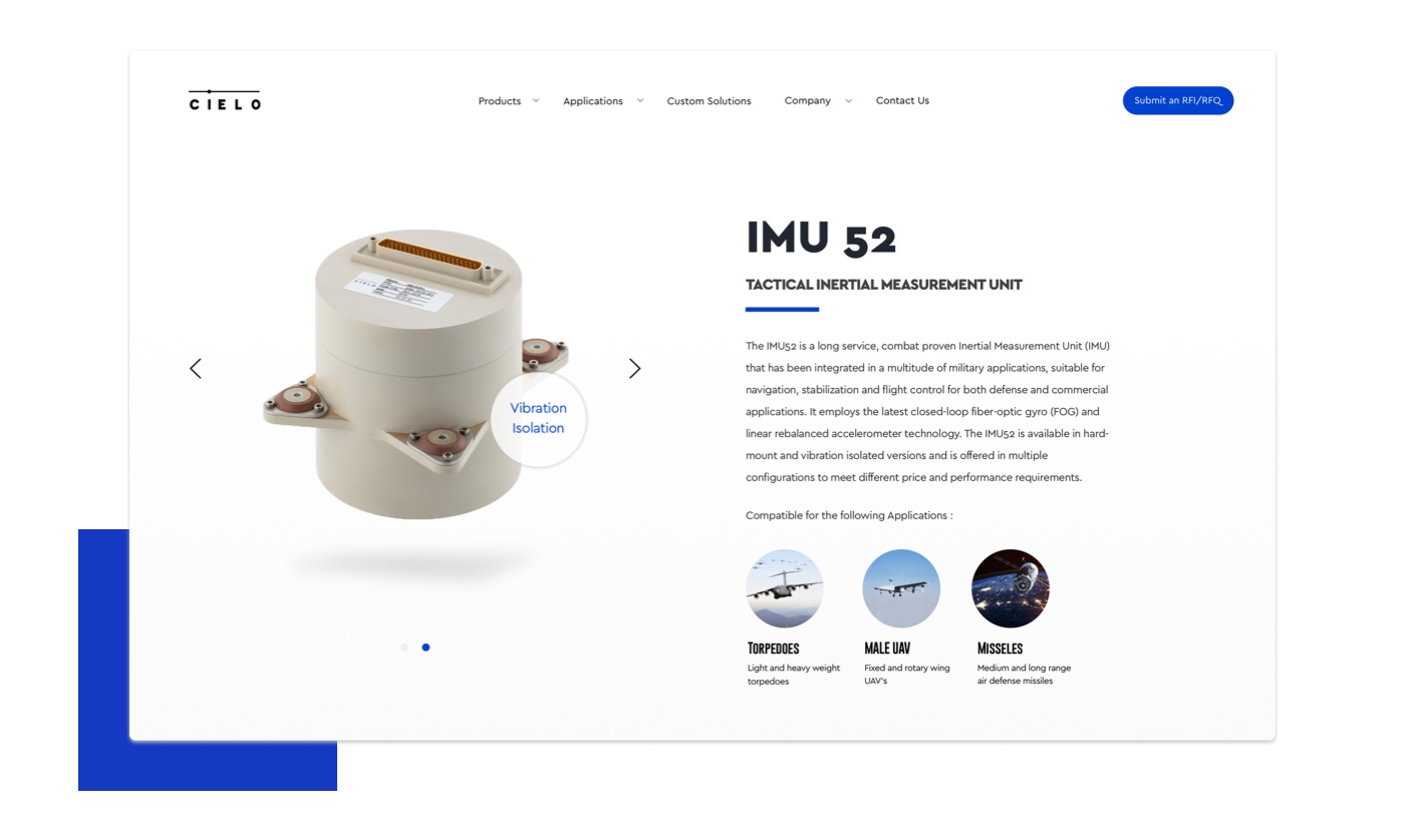
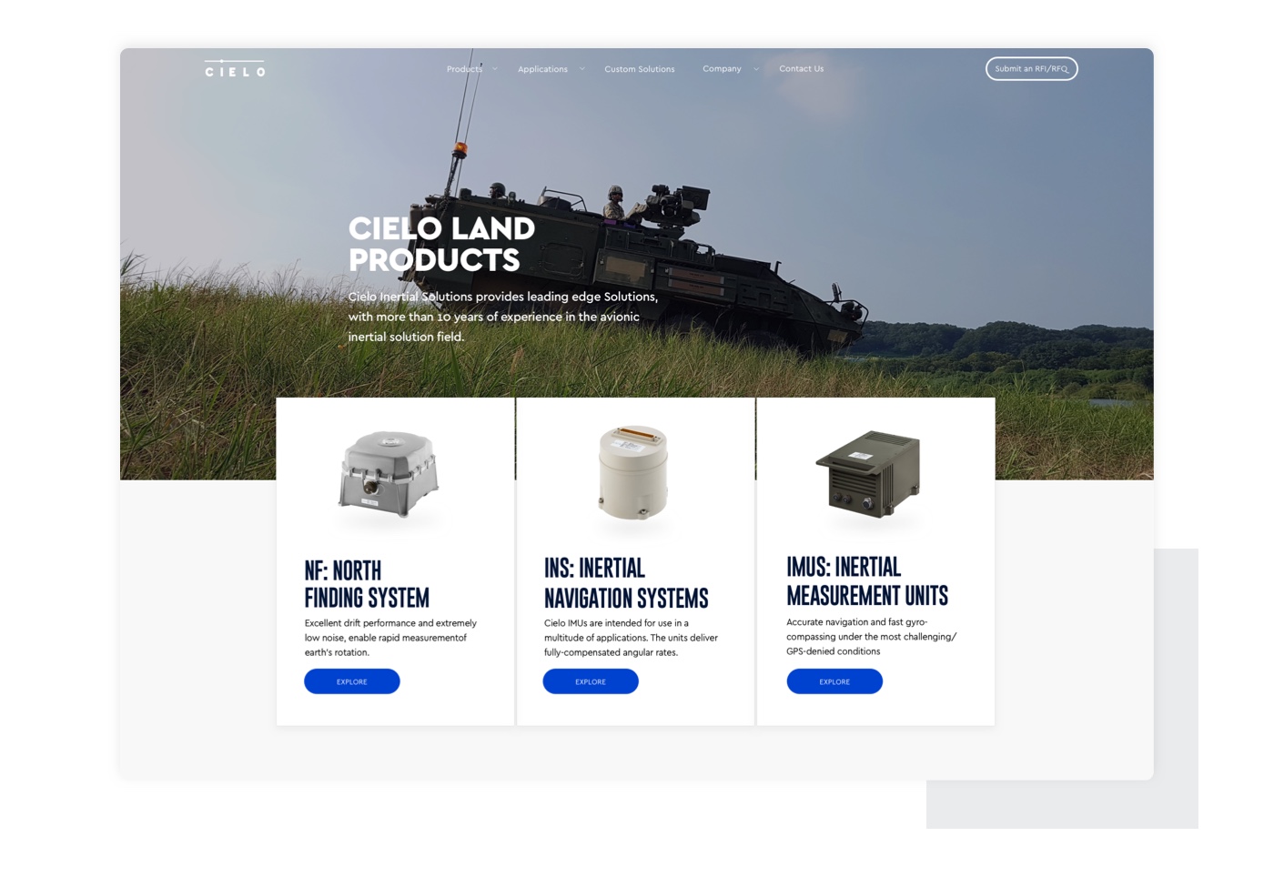
Before launching into the design process, careful research, discussion and decision-making needs to take place in order to define the problems we’re about to solve. and in order to communicate the correct message, while directing the right audience to the right place. After the initial research, we realized that every Cielo’s client is different, some of them need the whole package, but many are looking for a specific product or a custom solution. To help Cielo effectively cater to all target audiences, we had structured the new website navigation to support two dedicated paths:
- Products: IMU, INS, NF, GC, IRU
- Applications: Air, Land, Marine, Space
Planning the Customer Experience
For many businesses, the website is undoubtedly one of the most important features. It acts as a virtual “storefront” and must not only provide all the information and support their customers need, it also must perform well, be easy to navigate and look attractive. For a time-scarce audience, you have a split second to capture the attention of a visitor and convert traffic into leads.
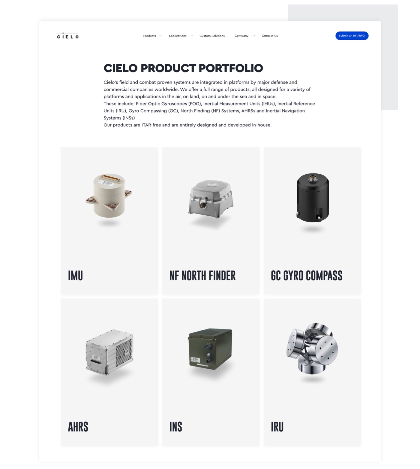
Our team of designers and UX specialists defined and designed the ideal Customer experience for Cielo. By mapping the information architecture that guided our process - we were able to identify key steps in the buyer’s journey and designed on-page solutions to drive customers to specific CTA’s (call to action).
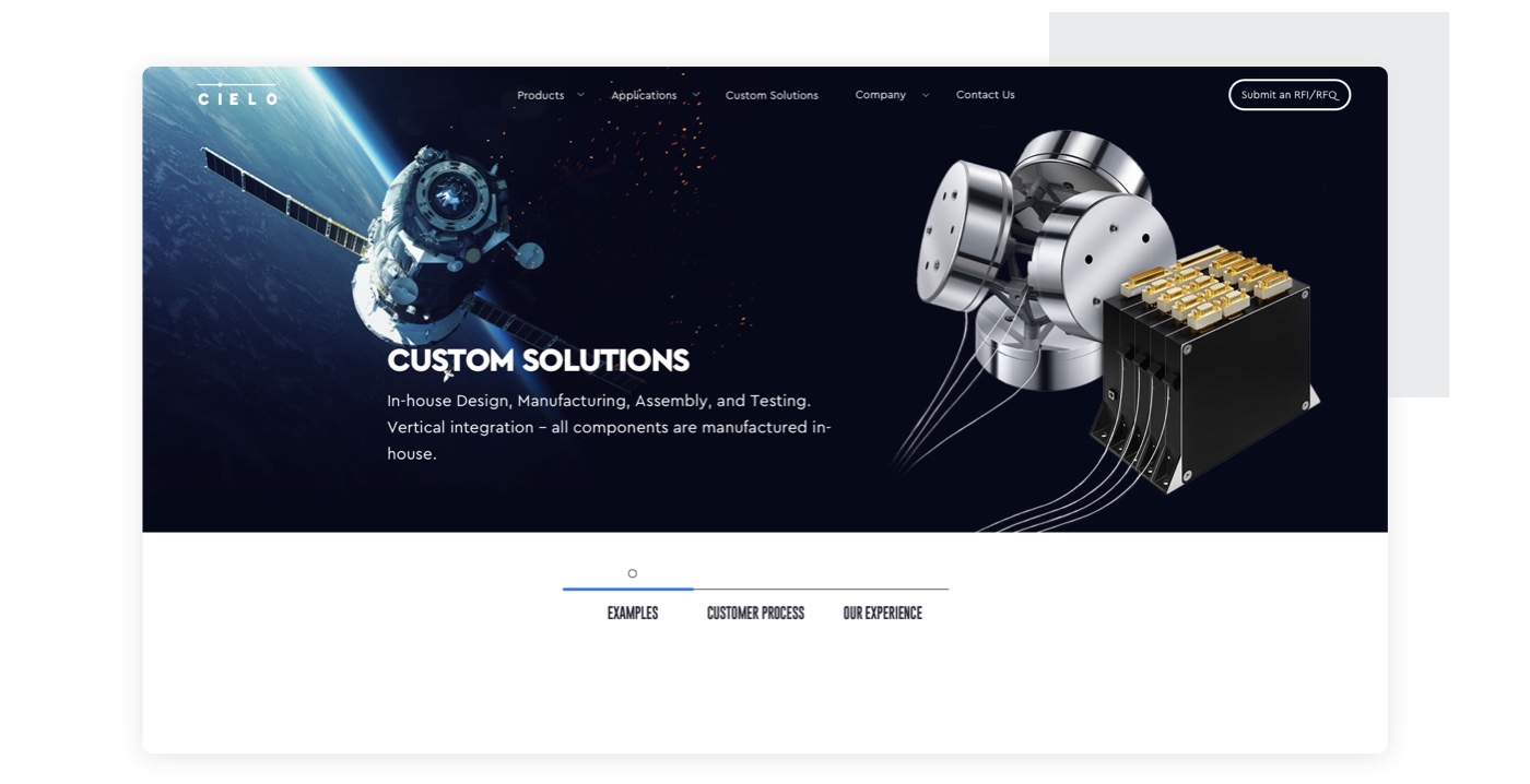
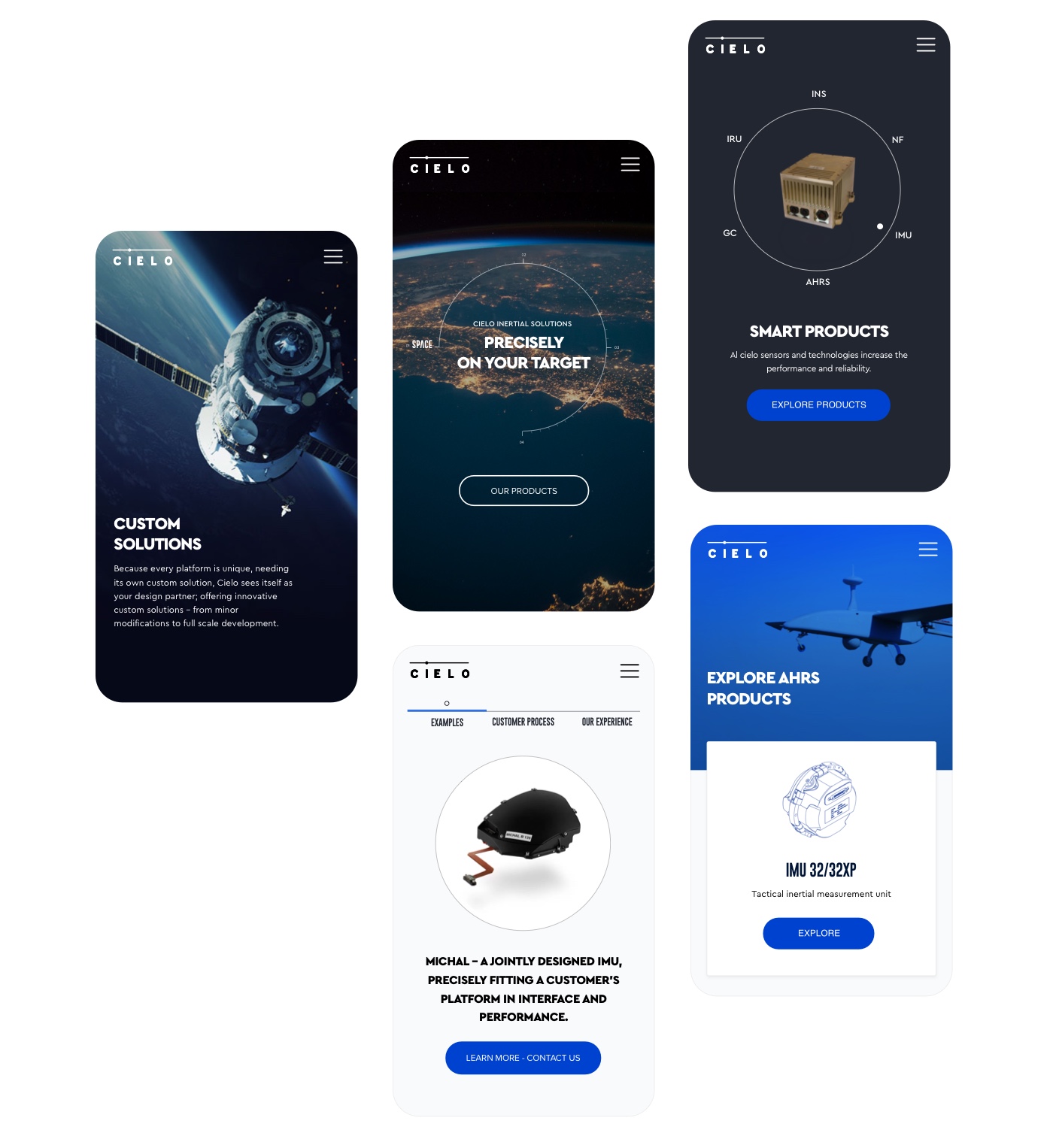
Because Cielo offers a wide range of Custom Solutions, we had to think about different pages in a different way. “Custom Solutions” page is a great example of our UX approach.
We divided the page into 3 sections: “Examples”, “Customer Process” and “Use Cases”,
This separation helped to deliver the message in a much more accessible way for cielo clients, who seek to get a better understanding of Cielo’s custom capabilities and offerings. Even though the page is aiming for sophisticated B2B buyers, we still wanted to make it user-friendly and accommodating.
Wrap up
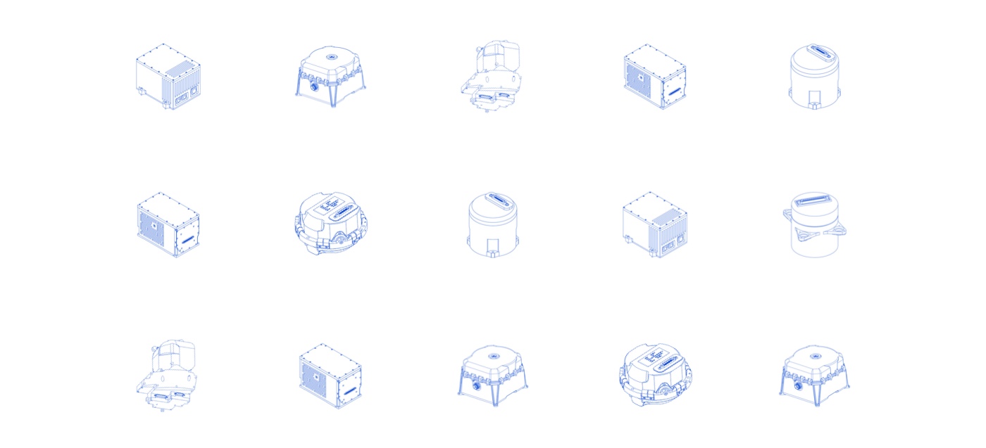
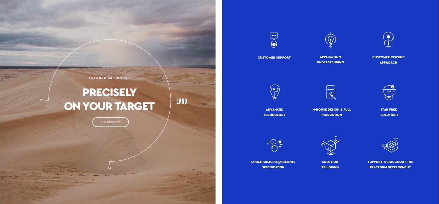
With this project, we achieved even more than we planned for. We’ve not only helped Cielo to extend their new beautiful identity to the web, we also created an additional layer of the company’s visual language for the digital domain. This ‘additional layer’ can be used outside the website, too: for other online and offline positioning needs, in marketing materials and even product design.
visit website



 in Tel Aviv