Context
An enterprise website is a special kind of web design. It has to cover a wide range of needs. It has to be an effective vehicle for many different business goals, from lead generation to recruitment to brand messaging. It needs to support marketing, sales, SEO and so much more, including behind the scenes components like storage management and software integration.
The best examples of enterprise websites are extensive yet easy to navigate, scalable and made for future growth. They hold a wealth of content that can be managed quickly. Lots of traffic comes in, so sometimes there is a need to A/B test and then to adjust and change some of the pages to make sure they are converting visitors at a higher rate.
Muze helps enterprise companies to orchestrate research, strategy and execution that go behind designing or redesigning a website. One of our latest enterprise projects is Optimove.
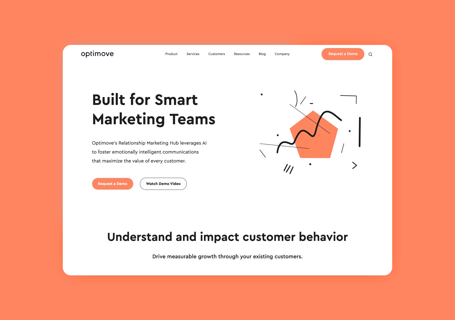
Optimove is the science-first relationship marketing hub. With a customer data platform at its core, Optimove autonomously transforms data into actionable insights, helping customer-centric businesses drive measurable growth. The company’s unique technology suite enables the measurement and optimization of highly personalized multi-channel campaigns at scale. Optimove serves various industries, including retail, eCommerce, travel and hospitality, gaming, and financial services. Optimove is used by hundreds of leading brands of all sizes, including Staples, Deezer, GVC, Family Dollar, J.Jill, lastminute.com, Talkspace and Sweaty Betty. Optimove employs over 200 people in its New York, London and Tel Aviv offices.
Recently Optimove went through its first rebranding. Here is a quote from the company’s blog:
"Our new look is the perfect representation of where we are today and the values that lead us – a shrewd, innovative, scientific approach, alongside a strong commitment to our clients and partners to provide the products and services that best solve their relationship marketing challenges"
Optimove’s new identity system was developed by an internal design team, with the help of famous Israeli graphic artist and typographer Oded Ezer who created a new logo.
Information Architecture
Today, redesigning an enterprise website is no longer just a step in the rebranding process. It’s a project on its own. Muze was invited to lead this project. We’ve created an information architecture and UX flow. We’ve also worked closely with Optimove’s VP Marketing, product managers, content creators and an internal design team to ensure the process and outcomes remain aligned throughout the project.
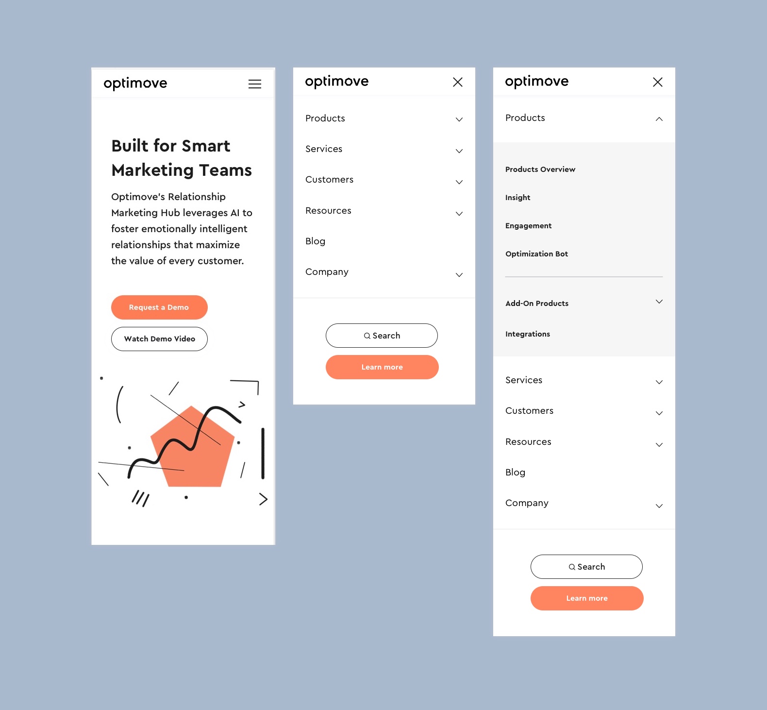
The most crucial part of any enterprise website is navigation, a way to connect your users to the content that:
A) They are looking for
B) You want them to see
The key is creating a good information architecture.
The foundation for our work, naturally, was Optimove’s old website. It was decided to maintain the same high-level structure, with local improvements of a user flow that are based on our insights.
The final website has six main sections, with several subsections in each (up to ten in some cases) and a multitude of pages. To organize all that content in the most optimal way, we needed to touch bases with the company’s stakeholders on multiple occasions and make sure that every decision gets supported by their expertise and available data.
UX Design
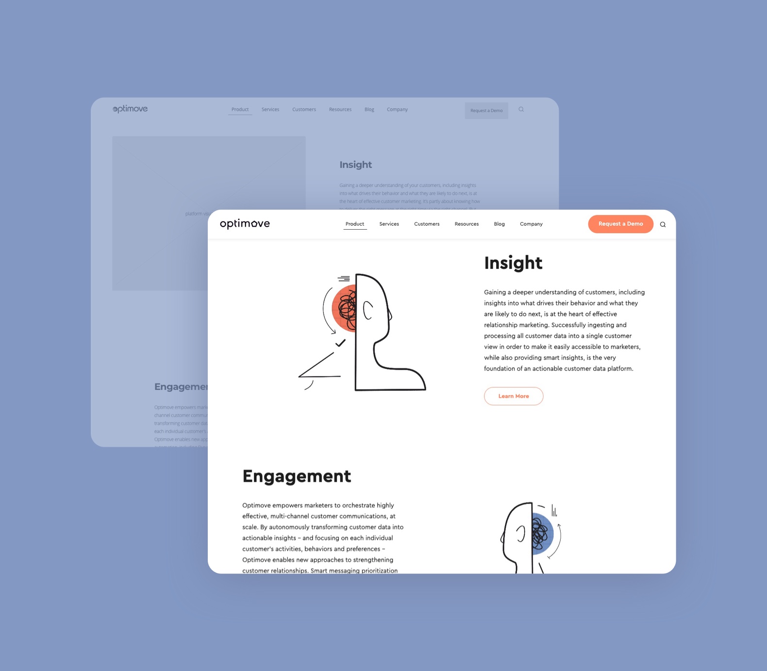
After creating navigation that laid a foundation for the website, we moved on to UX design. For this project, Muze adopted the visual storytelling approach to deliver the best possible user experience and make sure the user’s journey run smoothly.
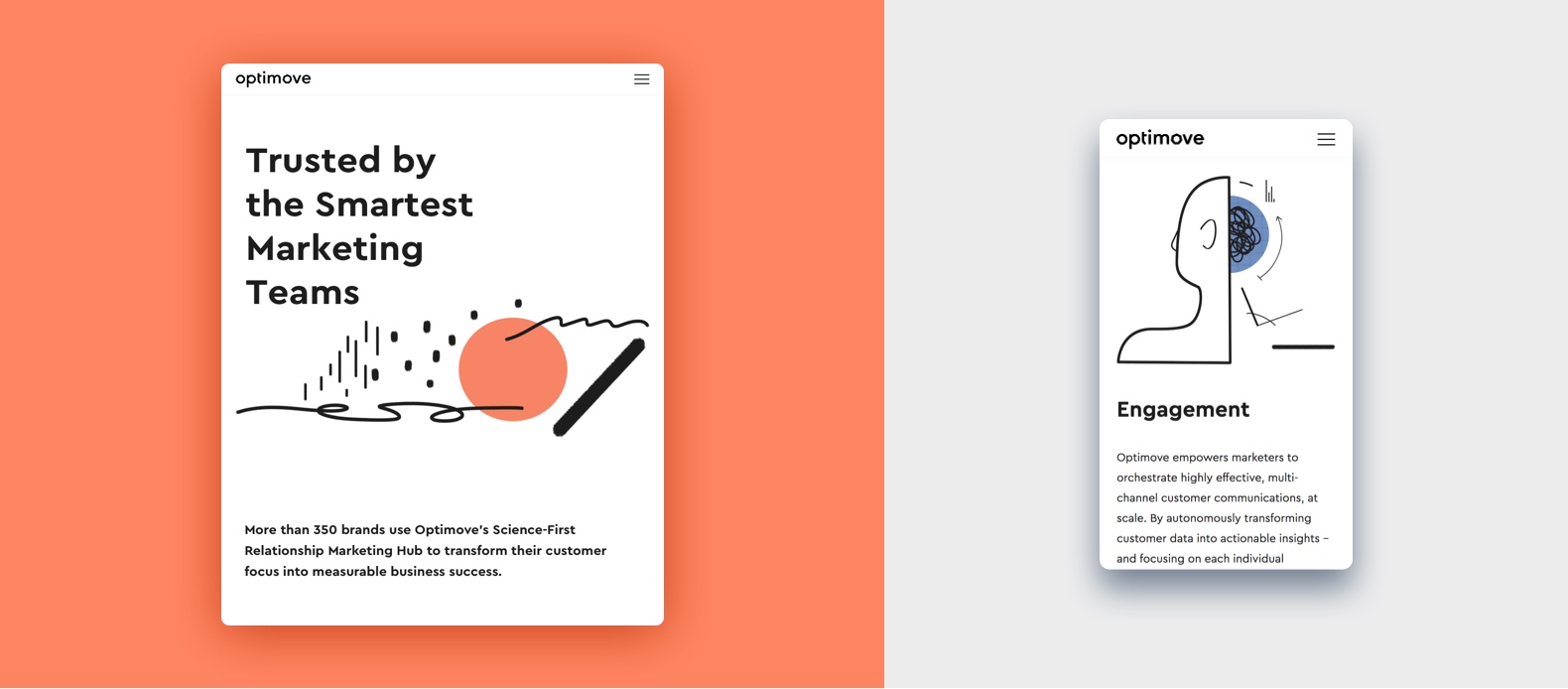
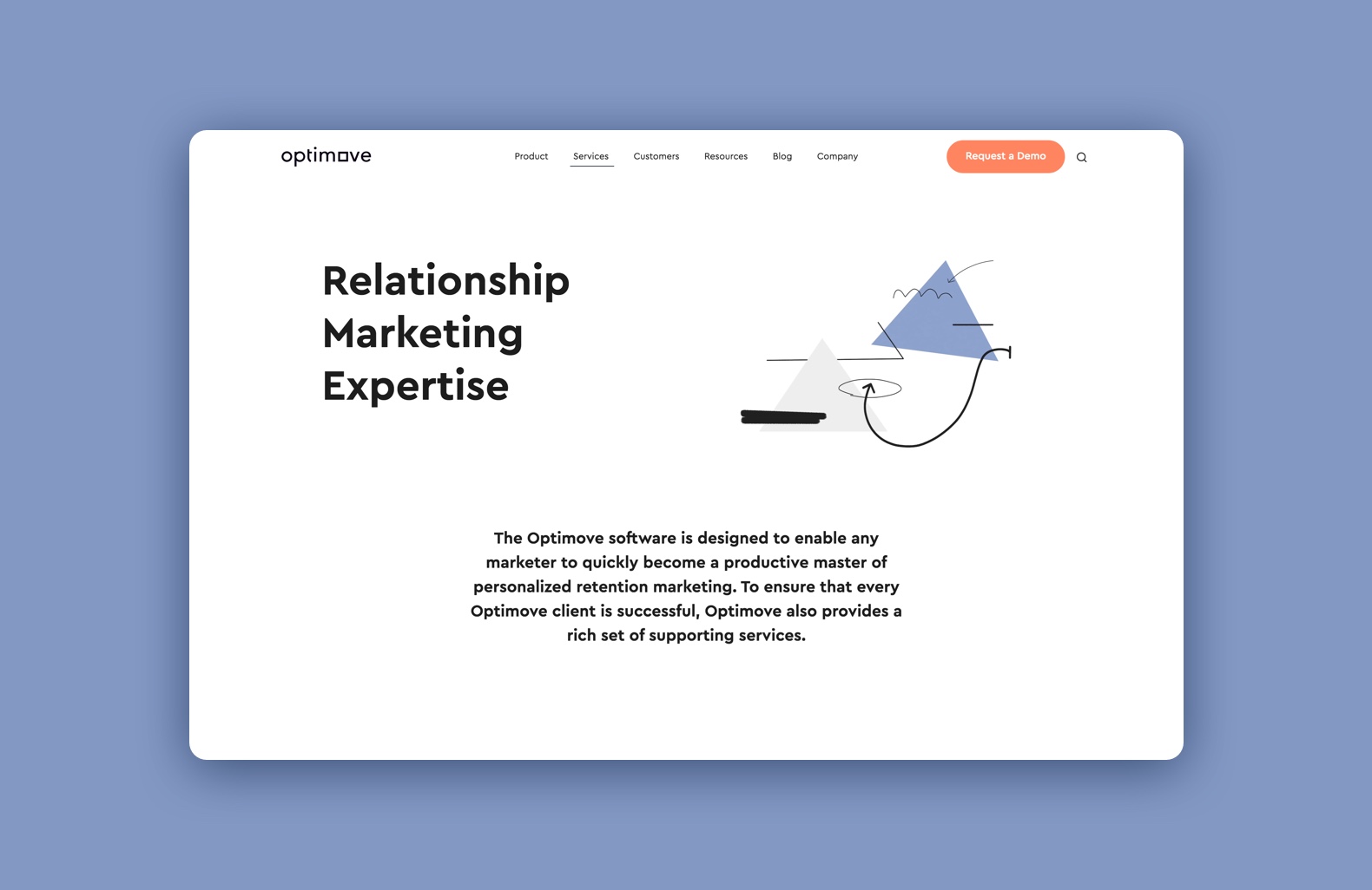
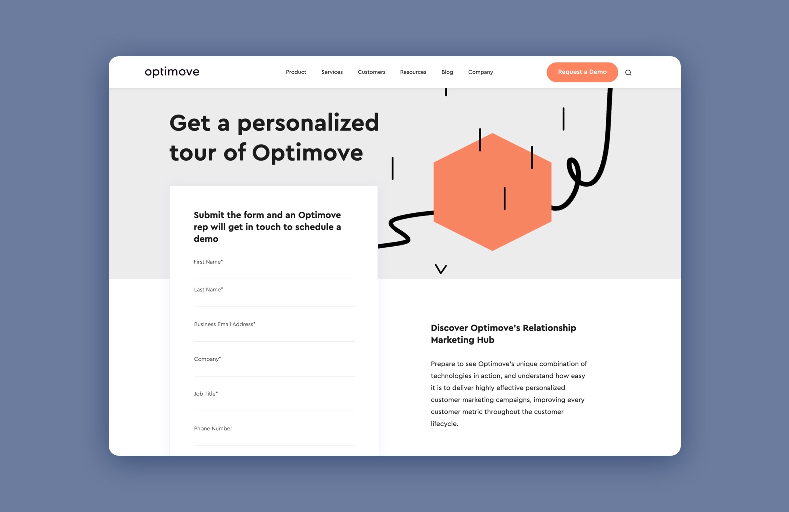
Optimove’s website tells a story of a company that makes a strong promise, propels innovation and efficiency and knows how to deliver on it. Our goal was to make the user feel like they are in the right place, no matter what page they landed on. And, of course, to highlight the value of Optimove products and services — as they are the centerpiece of the website.
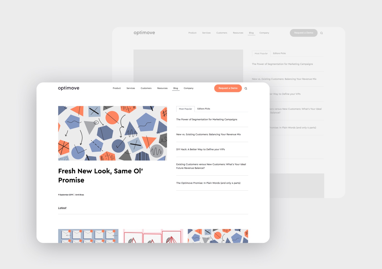
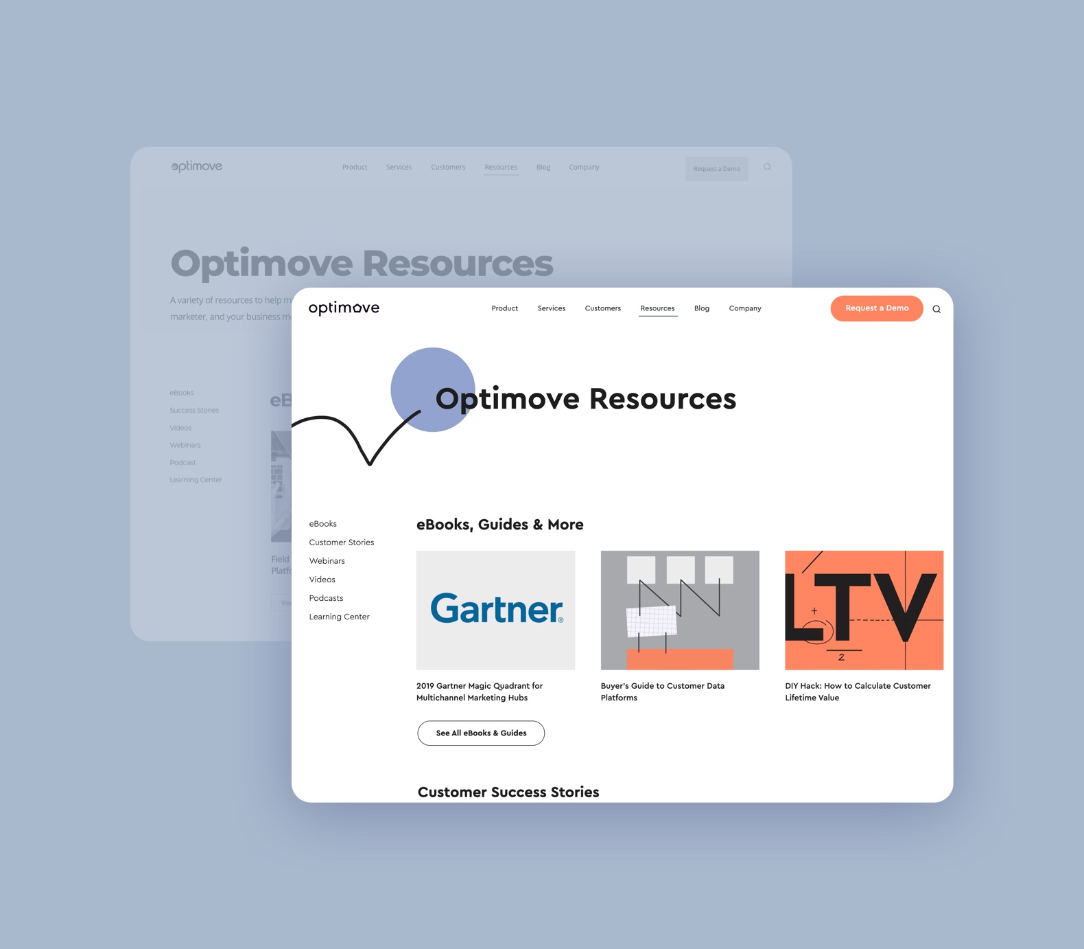
An additional issue to deal with in this project was the necessity to import a lot of content (old blog posts, for example) to the new website. Everything had to look good and be a part of the new design. So the new layouts we established together with the internal design team was adjusted to accommodate all existing company resources.
Development Stage
A website development process, especially when we’re talking about a large-scale website, can get real cluttered real fast. We know that the cost is high because we not only design but also develop many of our projects — for the clients who are looking for an end-to-end service, from the idea to the final website.
In the case of Optimove, we were working with their development team, but the process was all the same. Muze’s motto is: don’t let developers guess a single thing. The way we conduct a development stage doesn’t leave room for even a tiny uncertainty. Every asset is properly documented, the communication is always open, everything is done on time.
Outcomes
We are proud to execute this project without major crises or pitfalls. Muze was able to plan every step of the process, to deliver according to the project’s timeline and to communicate every stage’s goals and expectations with the client. After our work was done, Optimove’s internal design team implemented new branding and created illustrations that added a beautiful finish to the website. That was an amazing collaboration and a chance for Muze to shine and demonstrate our expertise in enterprise website design and project management.
visit website


 in Tel Aviv